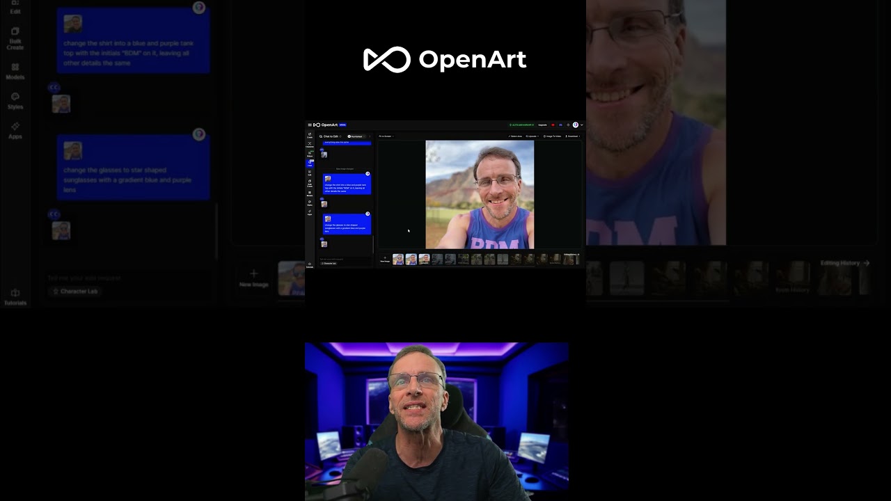
The video showcases the creator’s process of creatively enhancing an image by transforming the glasses into vibrant sunglasses and correcting the shirt’s lettering from “PDM” to “BDM,” all while preserving key original elements like the mountain and cloud background. Throughout, the creator balances bold design changes with careful attention to detail, culminating in a polished final image that accurately reflects their branding and artistic vision.
The video begins with the creator experimenting with altering the glasses in an image, changing them into sunglasses featuring a gradient blue and purple lens. This modification is described as a bold and creative move, showcasing the creator’s willingness to push the boundaries of the original design. The transformation of the glasses is visually striking, adding a fresh and vibrant element to the image while maintaining the overall integrity of the original artwork.
As the creator continues, they notice a small but significant detail: the letters on the shirt read “PDM” instead of the intended “BDM.” This realization prompts a decision to correct the lettering, demonstrating the creator’s attention to detail and commitment to accuracy. Despite this change, the creator emphasizes that the core elements of the image remain untouched, preserving the original mountain and cloud shapes, which are key features of the background.
The creator then discusses the subtle adjustments made to accommodate the new sunglasses, such as shifting parts of the image slightly to make room for the altered eyewear. Importantly, these changes do not affect the identifying characteristics of the face, highlighting the creator’s skill in making precise edits that enhance the image without compromising its recognizable features. This careful balance between modification and preservation is a central theme throughout the video.
Next, the focus shifts to changing the letter “P” on the shirt to a “B,” aligning the text with the intended branding of “Bob Do Media.” The creator also considers adding quotation marks to the text for clarity and emphasis. This step underscores the importance of branding and messaging in the image, ensuring that the final product accurately represents the creator’s identity and intentions.
The video concludes with the creator expressing satisfaction with the final edits, praising the quality and effectiveness of the changes made. The enthusiasm and humor in the closing remarks, including a playful comment about subscribing, add a personal and engaging touch to the presentation. Overall, the video showcases a thoughtful and creative process of image editing, balancing bold experimentation with meticulous attention to detail.